Basics of Web Design
Web Design refers to the planning, conception, layout and design of a website. It is not only concerned with the appearance of a website, but also with the interaction of its functions.
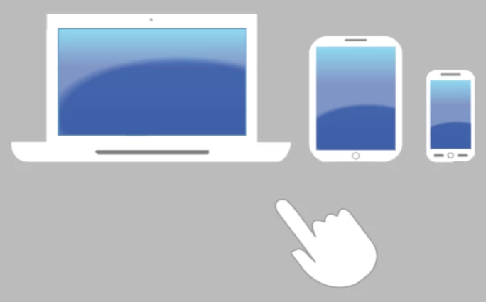
In the past, the term web design was used to refer to the development of web sites that could only be viewed in a desktop browser. In some cases, websites were even designed for a specific screen resolution.
Today, however, mobile devices such as smartphones and tablets play an increasingly important role. Today, web design means creating websites for many different devices with a wide range of screen resolutions.
The familiar Look and Feel of a website, the usability and the user experience are always part of web design. This includes the following points:
The right choice and combination of colors, fonts and images are crucial for the first impression.
The logical layout, content structure, and navigation determine the design of the site.
Choice of interactive design elements. Ease of use is especially important here.
What is Good Web Design?
Good Web Design …
-
has a well-defined theme and a clear message.
-
has a simple, easy to understand and clear navigation.
-
also works very well on mobile devices such as smartphones and tablets.
-
has small loading times, i.e. the web page loads fast.
-
is limited to a small number of colors. When choosing colors, follow the rule: Less is more.
-
limits itself to a maximum of 2 different fonts and uses only a small number of different font sizes for headings, paragraphs, and lists.
Above all, good web design means that users can quickly find the content they are looking for.
Nothing is more unpleasant for the user of a website than having to wade through a confusing or illogical navigation system to find the information they are looking for. If visitors can't find their way around the website or get lost in the navigation jungle, they will leave the site in a state of frustration.
Clear navigation without sub-menus is best. If extensive navigation is unavoidable, menu items that logically belong together should be highlighted.
Menu items that are not important at the moment should be hidden as they distract attention. More than 6 to 8 relevant menu items are difficult to grasp at a glance.
Web Design Introduction
The two languages HTML (HyperText Markup Language) and CSS (Cascading Style Sheets) form the basis of web design.
HTML is used to define what is displayed on the web page. This means that HTML only defines the structure and content of the page. The markup of the HTML file does not contain any information about the design of the web page.
CSS, as a direct complement to HTML, is used to design the layout of the web page. The design can be outsourced to a separate CSS file so that all pages of the complete website can use the stylesheet definitions. This provides a complete separation between layout and content.
Typical content of the associated CSS file is:
-
Definitions for sections resp. areas
header (headline)
nav (Navigation)
article (main content) and, if applicable
aside (side column) and
footer (footnote) -
Definitions for fonts
-
Definitions for Headings, Paragraphs, and Lists
-
additional definitions, for example Contact Form, Info Boxes, Buttons, …
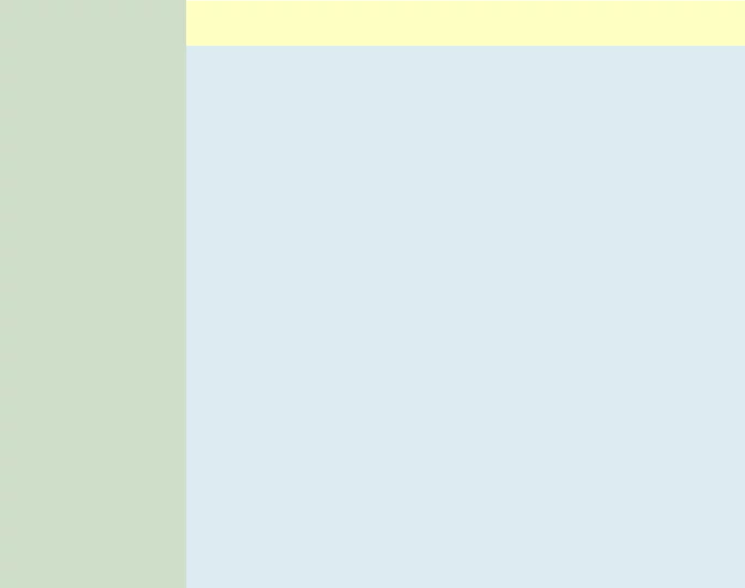
This layout also works on smartphones and tablets. However, in portrait mode, the maximum usable line length of the right column is too short. If the screen width is between 320 and 480 pixels, the content column cannot display enough characters per line because the left column uses between 40 and 60 percent of the available screen width.
On the page Responsive Web Design, I show how to solve this problem using media queries. For displays with small screen width, the navigation (i.e., the left column) must be modified so that the entire screen width is available for the content column.
HTML Sourcecode
<!DOCTYPE html>
<html lang="en">

<head>
<title>Web Page Title</title>
<meta name="description" content="Web Page Description">
<meta name="keywords" content="Web Page Search Terms">
<meta charset="utf-8">
<meta name="language" content="en">
<meta name="audience" content="all">
<meta name="robots" content="index, follow">
<meta name="robots" content="all">
<link href="favicon.png" rel="icon" type="image/png" size="32x32">
<link href="styles.css" rel="stylesheet" type="text/css">
</head>

<body>
<nav id="sideNav">
<ul>
  <li><a class="active" href="/">Home</a>      <!-- Homepage URL --></li>
  <li><a href="/news.html">News</a>            <!-- "News" URL --></li>
  <li><a href="/contact.html">Contact</a>      <!-- "Contact" URL --></li>
  <li><a href="/about-us.html">About us</a>    <!-- "About us" URL --></li>
</ul>
</nav>

<div id="container">
<header id="headline">
<h1>Main Heading of the web page</h1>
</header>

<article id="content">
<h2>Main Content of the page</h2>
<p>Dummy text does not always have to be Lorem Ipsum.</p>

<p>Unlike previous web pages, we no longer need to program two different versions for Internet Explorer and other browsers. Now, one page is sufficient for all browsers and devices, whether it's for printing or displaying on a smartphone. It's important to note that one page is enough for all browsers and devices.</p>

<p>HTML, CSS, and JavaScript have rules; Words you may have heard before. The Standards ensure everyone can use the website without restrictions. Unlike before, we no longer have to develop two different websites for Microsoft Edge and Mozilla Firefox.</p>
</article>
</div>  <!-- End container -->
</body>
</html>
CSS Sourcecode
* {
  box-sizing: border-box;
}

body {
  margin: 0;
  padding: 0;
  font-family: "Open Sans", "Liberation Sans", Arial, Helvetica, sans-serif;
  font-size: 1em;
  font-weight: normal;
  text-align: left;
  background: #dcebf2;             /* LightBlue */
  color: #222;                     /* BlackGrey */
  -moz-hyphens: auto;
  -o-hyphens: auto;
  -webkit-hyphens: auto;
  -ms-hyphens: auto;
  hyphens: auto;
}

#container {
  margin: 0 0 0 12.5em;            /* left column, width: 12.5em */
  padding: 0;
  height: 100%;
}

#content {
  margin: 0;
  padding: 0 0.625em;
  width: 100%;
}

/** ####################
 ** ##  Main Heading  ##
 ** #################### */
#container #headline {
  margin: 0 0 2em 0;
  padding: 0 0.625em;
  width: 100%;
  height: 2.5em;                   /* Heading height: 2.5em */
  top: 0;
  left: 0;
  background: #feffc1;             /* LightYellow */
  overflow: hidden;
}

#container #headline h1 {
  margin: 0;
  padding: 0;
  font-size: 1.5em;
  color: #222;                     /* BlackGrey */
}

/** ######################
 ** ##  Content Styles  ##
 ** ###################### */
#content h1, #content h2, #content h3 {
  display: inline-block;
  margin: 0 0 1.25em 0;
  padding: 0;
  font-size: 1.3em;
  font-weight: bold;
  text-align: left;
  color: #b00;                     /* DarkRed */
}

#content p {
  margin: 0 0 1.25em 0;
  padding: 0;
  color: #000;                     /* Black */
}

#content p+h1, #content p+h2, #content p+h3 {
  margin-top: 2.5em;
}

#content a {
  font-size: 1em;
  text-decoration: underline;
  color: #0000df;                  /* Blue */
}

#content a:hover {
  text-decoration: underline;
  color: #df0000;                  /* Red */
}

/** ##############
 ** ##  Button  ##
 ** ############## */
#content .cssbtn {
  display: block;
  margin-bottom: 2.5em;
}

#content a.button {
  display: inline-block;
  margin: 1em 0.2em 1em 0;
  padding: 0.46em 1.2em;
  font-size: 1.4em;
  font-weight: 600;
  text-decoration: none;
  text-shadow: 0 0.04em 0.04em rgba(0,0,0,0.35);
  text-align: center;
  background: #b00;                /* DarkRed */
  color: #fff;                     /* White */
  transition: all 0.15s;
  border: 0.125em solid #000;
  border-radius: 0.5em;
  box-sizing: border-box;
}

#content a.button:hover {
  text-shadow: 0 0 2em rgba(255,255,255,1);
  background: #e00;                /* LightRed */
  color: #000;                     /* Black */
  border-color: #000;
}

/** ###############
 ** ##  sideNav  ##
 ** ############### */
#sideNav ul {
  position: fixed;
  margin: 0;
  padding: 0;
  width: 12.5em;
  height: 100%;
  list-style-type: none;
  background: #d0dec9;             /* MintGreen */
  overflow: auto;
}

#sideNav ul li {
  border-bottom: 2px solid #bbb;   /* LightGrey */
}

#sideNav ul li a {
  display: block;
  padding: 0.5em 1em;
  text-decoration: none;
  color: #000;                     /* Black */
}

#sideNav ul li a.active {
  background: #d0ffc9;             /* LightGreen */
  color: #000;                     /* Black */
}

#sideNav ul li a:hover:not(.active) {
  background: #ccc;                /* LightGrey */
  color: #000;                     /* Black */
}
Live preview of this web page template Simple 2 Column Layout with Header.
Download