What does Responsive Web Design (RWD) Mean??
Users are increasingly accessing the Internet from mobile devices. As a result, it is no longer enough for websites to look good on a desktop or laptop monitor (or even on a preselected Standard Display Size).
Tablets, netbooks, and smartphones have different screen resolutions than desktop computers and laptops. All of these different displays need to be considered when designing a website. Responsive Web Design ensures that a website looks good and is easy to use on any device.
Responsive Web Design means that websites automatically adapt to the available screen size.
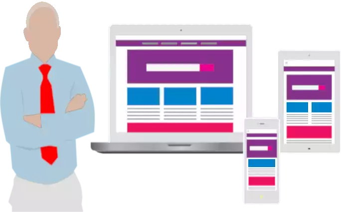
With responsive design of web pages, all users see the same HTML document in their browser, regardless of the device they are using to access the Internet. The CSS Code controls the output for different screen sizes.
A web page is mobile friendly, if
-
it is displayed in an appealing and accessible way with any browser on any device.
-
all content can be viewed quickly and easily without zooming.
-
it has short loading times.
-
all links and buttons can easily be identified and are clickable.
A Web page is mobile unfriendly, if
-
the font is too small or too hard to read.
-
it takes too long to load. 3 seconds to load is already much too much.
-
if only desktop computers are able to display parts of the content in an optimal way.
-
the content is too wide, so that horizontal scrolling is required.
Basics of Responsive Web Design
You may be wondering what the ideal screen width is for your web pages. Unfortunately, there is no one-size-fits-all answer to this question. The use of Smartphones, Tablets, Laptops and Desktop Computers means that different displays and screen resolutions need to be considered. Responsive Web Design means that the layout of the web page responds to the user's needs. This means that the layout of the web page must be flexible and adapt to the size of the browser window. Content, Navigation, and Page Structure must be optimized for each screen resolution.
Browsers internally work with the Viewport Concept. To ensure that the Viewport Width matches the width of the display, a Meta Viewport specification must be included in the <head> section of each web page. Without this meta tag, mobile devices would shrink the page to fit the screen.
Define the visible area with Meta Viewport
<meta name="viewport" content="width=device-width, initial-scale=1.0, user-scalable=yes">The following three rules must be (strictly) followed in responsive web design:
-
Do not use an absolute font size.
If the font is specified in px, the user's browser setting is ignored. It is better to specify a relative font size. The two relative font sizes em and rem use the browser's default setting. The default font size is always set to a value of 1em. Most browsers use 16px as the default.
-
Do not use a fixed image size.
The problem with images is that high-resolution images consume more data and therefore take longer to load. One solution to this problem is to store multiple resolutions for the same image on the server and then transfer the image with the appropriate resolution.
-
Do not use absolute values for different regions of the layout.
The layout must be flexible. Otherwise, different screen resolutions may cause unwanted shifts in the areas. Values in percent or em are better than values in px.
The layout of the page must also react to changes in the size of the browser window.
What are Most Common Screen Resolutions?
There have never been as many different devices for accessing the Internet as there are today. As a result, there are more potential screen resolutions available today than there have ever been before. Unfortunately, we don't have a clear answer for ideal screen width in web design. However, there are a few resolutions that are used more often than others, so it's better to look at resolution ranges when designing a website because the resolution for many different devices falls within a certain range.
The most common screen resolutions are:
-
Desktop: 1024x768 bis 1920x1080
-
Smartphone: 360x640 bis 720x1280
-
Tablet: 601x962 bis 1280x800
Media Queries allow you to customize the layout of your web page to fit the browser's width.
What are CSS Media Queries?
Media Queries were introduced in the year 2000 with CSS3 and are used in the Responsive Web Design. They are a CSS feature that allows the display of a website to be optimized for different devices.
Media Queries are an essential part of CSS3. They consist of an optional Media Type and can contain one or more conditions that can be combined using logical operators. They start with @media to modify some CSS properties for specific screen resolutions.
The following Media Types are possible:
| Media Type | Explanation |
| all | all Output Media |
| screen | Display on a scrolling screen, i.e. Smartphone, Tablet, Laptop or Desktop Computer |
| Display on several pages, which means output on the Printer, but also output as a PDF file or Print Preview in the browser. | |
| speech | Reading aloud by a Speech Synthesizer. |
However, you do not need to specify the Media Type. If the Media Type is not specified in the Media Query, the Media Type all is used by default. It is generally recommended that you specify the Media Type in the query.
Media Queries work much like an if clause in a programming language. Basically, the query simply asks whether the device you are addressing has certain properties, called Media Features. If the device has these Features, the specified styles are applied, otherwise they are ignored.
The most common Media Features used for Responsive Web Design are:
| Media Feature | Explantion | Example |
| width | Viewport Width in Pixel | min-width: 360px |
| height | Viewport Height in Pixel | min-height: 640px |
| orientation | Screen Orientation: Portrait or Landscape mode | orientation: landscape |
| resolution | available Screen Resolution | min-resolution: 72dpi |
Mobile First vs. Desktop First
Breakpoints with min-width are Mobile first
With the Mobile first approach, you start with the website layout for the smallest screen, which is Smartphones in Portrait Mode. To do this, you write all style specifications for the smallest screen, or all specifications that are the same for all screen sizes, in the first part of the CSS without a Media Query. The CSS code is then adapted step-by-step for larger and larger screen sizes using Media Queries for a number of Breakpoints.
The style specifications within the Breakpoint Sections overwrite the style specifications for smaller screens.
Media Breakpoints in the mobile first approach
@media screen and (min-width: 480px) {}
@media screen and (min-width: 786px) {* screen width 786 pixel or wider */
}
@media screen and (min-width: 1024px) {* screen width 1024 pixel or wider */
}
@media screen and (min-width: 1200px) {* screen width 1200 pixel or wider */
}
Breakpoints with max-width are Desktop first
With the Desktop first approach, you start with the website layout for the largest screen, which is the Desktop Monitor. To do this, you write all CSS style specifications for the largest screen, or all specifications that are the same for all screen sizes, in the first part of the CSS without a Media Query. The CSS code is then adapted step-by-step for smaller and smaller screen sizes using Media Queries for a number of Breakpoints.
The style specifications within the Breakpoint Sections overwrite the style specifications for larger screens.
Media Breakpoints in the desktop first approach
* screen width 1200 pixel or wider */
...
@media screen and (max-width: 1199px) {* screen width smaller than 1200 pixel */
}
@media screen and (max-width: 1023px) {* screen width smaller than 1024 pixel */
}
@media screen and (max-width: 785px) {* Tablet Portait Mode
* screen width smaller than 786 pixel */
}
@media screen and (max-width: 479px) {* Smartphone Portrait Mode,
* screen width smaller than 480 pixel */
}
What does Media Query Breakpoints mean?
Media Query Breakpoints, or CSS Breakpoints for short, are the points at which the website layout should break. A @media rule specifies a particular screen width at which the layout should change. For example:
Define Media Breakpoints with min-width
@media screen and (min-width: 1024px) {}
or
Define Media Breakpoints with max-width
@media screen and (max-width: 1023px) {}
Breakpoints can be defined with min-width (i.e. Mobile first) or max-width (i.e. Desktop first) or a combination of both.
Typically, 3 or 4 breakpoints are sufficient to define a reasonable number of device classes. For example: Breakpoints at 380, 768, 1024, and 1200 pixels. Whether you choose the Mobile first or Desktop first approach is not really important. Both approaches produce the same browser output.
How do I Verify that the Website Layout is Responsive?
If you want to know how your responsive website will look on popular Smartphones and Tablets, I recommend using Responsinator or ResponsiveTestTool. These two websites will give you a first impression of how mobile devices will display your site. The output of these two simulators is usually sufficient. For precise tests, you should always use real devices. But typically, in addition to desktop computers, there are usually only some smartphones and maybe a small number of tablets available.
Responsive Web Design is not a trend, it's the latest technology. Using HTML5 and CSS Media Queries, the layout is flexible enough to make the site easy to use on any device.
Responsive 2 Column CSS Layout with Header
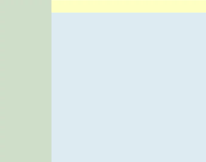
This sample layout adds responsiveness to the CSS layout from Web Design so that it is also suitable for smartphones in portrait orientation. Try resizing the browser window to see how it works. At the markers at position 900px and 480px, the navigation changes.
HTML Sourcecode
<!DOCTYPE html>
<html lang="en">

<head>
<title>Web Page Title</title>
<meta name="description" content="Web Page Description">
<meta name="keywords" content="Web Page Search Terms">
<meta charset="utf-8">
<meta name="language" content="en">
<meta name="audience" content="all">
<meta name="robots" content="index, follow">
<meta name="robots" content="all">
<link href="favicon.png" rel="icon" type="image/png" size="32x32">
<meta name="viewport" content="width=device-width, initial-scale=1.0, user-scalable=yes">
<link href="styles.css" rel="stylesheet" type="text/css">
</head>

<body>
<nav id="sideNav">
<ul>
  <li><a class="active" href="/">Home</a>      <!-- Homepage URL --></li>
  <li><a href="/news.html">News</a>            <!-- "News" URL --></li>
  <li><a href="/contact.html">Contact</a>      <!-- "Contact" URL --></li>
  <li><a href="/about-us.html">About us</a>    <!-- "About us" URL --></li>
</ul>
</nav>

<div id="container">
<header id="headline">
<h1>Hauptüberschrift der Seite</h1>
</header>

<article id="content">
<h2>Hauptinhalt der Seite</h2>
<p>Blindtext muss nicht immer Lorem Ipsum sein.</p>

<p>Im Gegensatz zu früheren Webseiten müssen wir zum Beispiel nicht mehr zwei verschiedene Webseiten für den Internet Explorer und einen anderen Browser programmieren. Es reicht eine Seite, die für alle Browser geeignet ist. Die Seite ist genauso gut zum Drucken oder für die Darstellung auf einem Smartphone geeignet ist. Wohlgemerkt: es reicht eine für alle Browser und alle Geräte.</p>

<p>So gibt es Regeln für HTML, CSS und JavaScript; Worte, die du vielleicht schon einmal gehört hast. Diese Standards sorgen dafür, dass jeder die Webseite ohne Einschränkung nutzen kann. Im Gegensatz zu früher müssen wir heute nicht mehr zwei verschiedene Webseiten für den Microsoft Edge und dem Mozilla Firefox entwickeln.</p>
</article>
</div>  <!-- End container -->
</body>
</html>
CSS Sourcecode
* {
  box-sizing: border-box;
}

body {
  margin: 0;
  padding: 0;
  font-family: "Open Sans", "Liberation Sans", Arial, Helvetica, sans-serif;
  font-size: 1em;
  font-weight: normal;
  text-align: left;
  background: #dcebf2;             /* LightBlue */
  color: #222;                     /* BlackGrey */
  -moz-hyphens: auto;
  -o-hyphens: auto;
  -webkit-hyphens: auto;
  -ms-hyphens: auto;
  hyphens: auto;
}

#container {
  margin: 0 0 0 12.5em;            /* left column, width: 12.5em */
  padding: 0;
  height: 100%;
}

#content {
  margin: 0;
  padding: 0 0.625em;
  width: 100%;
}

/** ######################
 ** ##  Haupt-Headline  ##
 ** ###################### */
#container #headline {
  margin: 0 0 2em 0;
  padding: 0 0.625em;
  width: 100%;
  height: 2.5em;                   /* Heading height: 2.5em */
  top: 0;
  left: 0;
  background: #feffc1;             /* LightYellow */
  overflow: hidden;
}

#container #headline h1 {
  margin: 0;
  padding: 0;
  font-size: 1.5em;
  color: #222;                     /* BlackGrey */
}

/** ######################
 ** ##  Content Styles  ##
 ** ###################### */
#content h1, #content h2, #content h3 {
  display: inline-block;
  margin: 0 0 1.25em 0;
  padding: 0;
  font-size: 1.3em;
  font-weight: bold;
  text-align: left;
  color: #b00;                     /* DarkRed */
}

#content p {
  margin: 0 0 1.25em 0;
  padding: 0;
  color: #000;                     /* Black */
}

#content p+h1, #content p+h2, #content p+h3 {
  margin-top: 2.5em;
}

#content a {
  font-size: 1em;
  text-decoration: underline;
  color: #0000df;                  /* Blue */
}

#content a:hover {
  text-decoration: underline;
  color: #df0000;                  /* Red */
}

/** ##############
 ** ##  Button  ##
 ** ############## */
#content .cssbtn {
  display: block;
  margin-bottom: 2.5em;
}

#content a.button {
  display: inline-block;
  margin: 1em 0.2em 1em 0;
  padding: 0.46em 1.2em;
  font-size: 1.4em;
  font-weight: 600;
  text-decoration: none;
  text-shadow: 0 0.04em 0.04em rgba(0,0,0,0.35);
  text-align: center;
  background: #b00;                /* DarkRed */
  color: #fff;                     /* White */
  transition: all 0.15s;
  border: 0.125em solid #000;
  border-radius: 0.5em;
  box-sizing: border-box;
}

#content a.button:hover {
  text-shadow: 0 0 2em rgba(255,255,255,1);
  background: #e00;                /* LightRed */
  color: #000;                     /* Black */
  border-color: #000;
}

/** ###############
 ** ##  sideNav  ##
 ** ############### */
#sideNav ul {
  position: fixed;
  margin: 0;
  padding: 0;
  width: 12.5em;
  height: 100%;
  list-style-type: none;
  background: #d0dec9;             /* MintGreen */
  overflow: auto;
}

#sideNav ul li {
  border-bottom: 2px solid #bbb;   /* hellgrau */
}

#sideNav ul li a {
  display: block;
  padding: 0.5em 1em;
  text-decoration: none;
  color: #000;                     /* Black */
}

#sideNav ul li a.active {
  background: #d0ffc9;             /* LightGreen */
  color: #000;                     /* Black */
}

#sideNav ul li a:hover:not(.active) {
  background: #ccc;                /* LightGrey */
  color: #000;                     /* Black */
}

@media screen and (max-width: 900px) {
  #sideNav ul {
    width: 100%;
    height: auto;
    position: relative;
  }

  #sideNav ul li {
    border-bottom: 0 solid #bbbbbb;
  }

  #sideNav ul li a {
    float: left;
    padding: 15px;
  }

  div#container {
    margin-left: 0;
  }
}

@media screen and (max-width: 480px) {
  #sideNav ul li a {
    text-align: center;
    float: none;
  }
}
Live preview of this web page template Responsive 2 Column Layout with Header.
Download